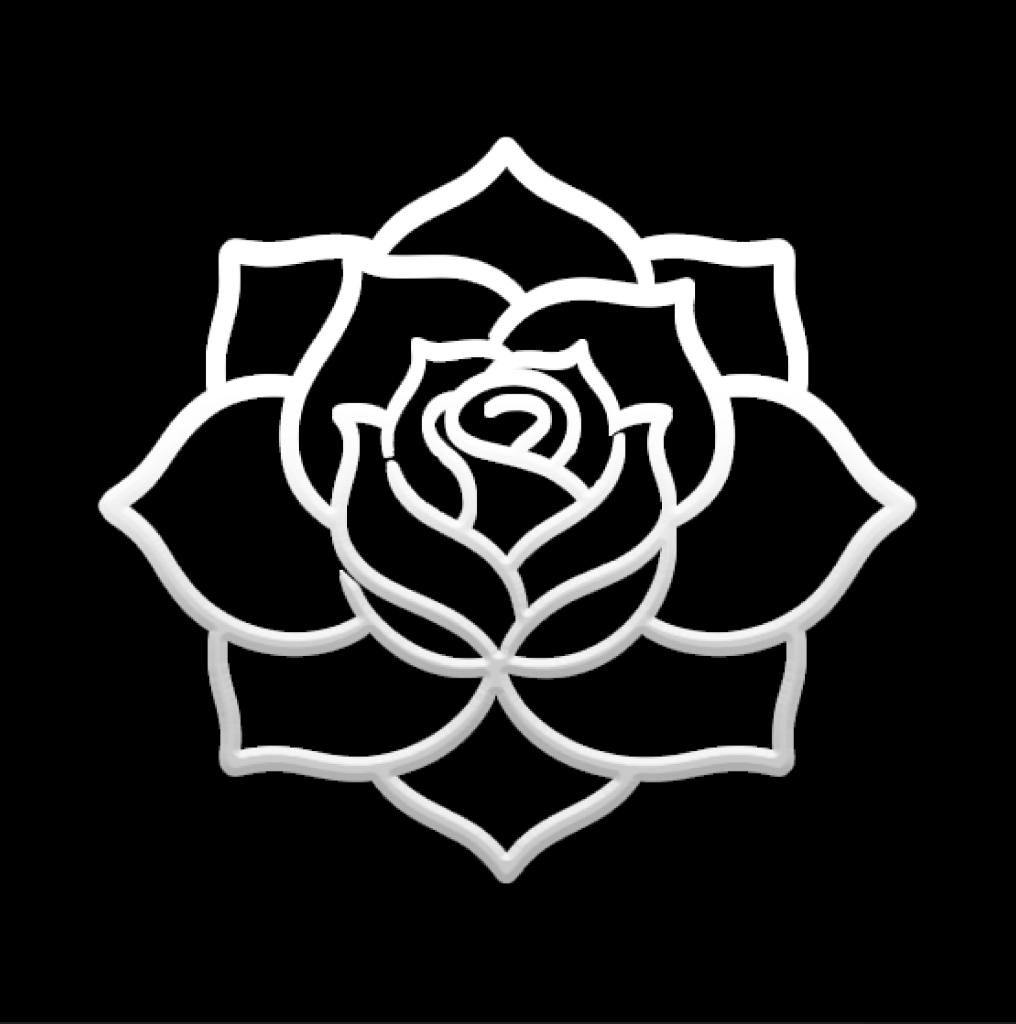


An AI tattoo generator removes the hardest part of getting inked: turning a feeling into a picture. Most people walk into a studio with a folder of screenshots that never quite match what they pictured. Describing the idea in words is easy — drawing it is not. This tool closes that gap. You write what you want, choose a style and a placement, and get a design you can actually hand to an artist.
What this tool does
You give it a sentence. It gives you a tattoo design. Behind that sentence sit four choices that shape the result more than the wording itself: style, placement, color palette, and composition. A "wolf under a moon" rendered as fine line on a forearm and the same wolf rendered as blackwork across a shoulder are two completely different tattoos. The generator treats those as separate inputs so you can hold the idea constant and explore the execution.
The output is a flat design on a clean background — the format an artist actually wants. Not a mockup on skin, not a photo with lighting baked in, but line and value you can trace, resize, and adjust.
How to write a prompt that works
The single biggest quality lever is specificity about form, not adjectives. "Beautiful rose tattoo" produces generic output because it describes how you feel about the result rather than what should be on the skin. "Single rose in profile, fine line, no shading, stem crossing diagonally" produces something an artist can stencil.
Four things worth naming explicitly:
Subject and pose. Not "a bird" but "a swallow mid-flight, wings back, viewed from below." Direction and angle carry more information than the noun.
Line weight. Fine line reads delicate and ages softer. Bold outline reads graphic and holds up for decades. This one choice changes the character of the piece more than the subject does.
Shading. Say "no shading," "light stippling," or "solid black fill." Left unspecified, you get an average of all three and usually like none of them.
Negative space. Minimalist work lives or dies on what you leave out. Naming the empty space — "strong negative space between the wings" — gets you there faster than asking for "minimalist."
Choosing a style
Style is the second input and it constrains everything downstream. A few of the most requested:
Fine line uses single-needle work for thin, precise linework. It suits small pieces, script, botanicals, and anything placed on the wrist, ribs, or behind the ear. Lines can spread slightly over years, so very tight detail needs an experienced hand.
Blackwork is solid black ink, high contrast, no gradient. It ages exceptionally well and reads clearly from across a room. Good for bold graphic shapes and coverage.
Traditional means heavy outlines, a limited palette, flat color fill. A century of tattooing has proven this style survives. If longevity is your first concern, start here.
Watercolor mimics paint bleeding on paper — soft gradients, splatter, edges fading to bare skin. Photogenic and distinctive, though lighter pigments fade faster and usually want a subtle line base underneath.
Geometric relies on mathematical precision: tessellation, sacred geometry, low-poly animal forms. Straight lines and exact symmetry demand a specialist, and closely spaced lines can merge over time.
Matching design to placement
Placement is not decoration, it is a design constraint. The body curves, moves, and stretches, and a design that ignores that will look wrong once it heals.
Forearm is a near-flat panel, easy to view, easy to tattoo. Forgiving for a first piece and good for vertical compositions.
Upper arm and shoulder curve significantly. Designs that flow with the muscle read well here; rigid straight-line geometry can distort.
Ribs hurt and stretch with breathing. Elongated compositions that follow the ribcage work; wide horizontal pieces fight the anatomy.
Wrist, ankle, finger take small work only. Fingers in particular have high turnover skin and fade fast — plan on touch-ups.
Back and chest offer the largest canvas and support symmetrical compositions built around the spine or sternum.
From generated design to real tattoo
A generated image is a starting point, not a stencil. Three things happen between the two.
First, an artist adapts the design to your body. Proportions that look right on a square canvas rarely map directly onto a limb. Expect the composition to shift.
Second, line weight gets reconsidered for how skin ages. What reads as elegant at screen resolution may close up over ten years. A good artist will thicken what needs thickening.
Third, the design gets simplified. AI output often contains more detail than skin can hold at the intended size. Removing detail is part of making it tattooable.
Bring the design as a reference and a conversation starter. Artists respond well to a clear visual brief and badly to a demand for an exact copy of something that will not work on skin.
Before you commit
Sit with the design for a week before booking. The concepts that survive a week are the ones worth permanent ink. Check the meaning of any symbol you did not invent yourself, particularly anything drawn from a culture that is not yours — a design that reads as beautiful in one context can be inappropriate in another. And choose the artist for the style, not for proximity: a specialist in fine line will produce a better fine line tattoo than a generalist five minutes closer to your house.